Tuesday 26 July 2011

My final logo design

My logo design: This was my final logo design which fits in with both the branding and wayfinding elements as the essentials of both are to define something in an image. Here I have shown the logo up in a place in the corridor, and I have shown my chosen colours and designs for it. I really liked my final logo design as I feel it encompassed the school without being too obvious or crude. I think that it is an honest image which utilizes colours and shape very well. I liked my use of line and tone to create someone which was simple whilst being well structured. If I had to do this exercise again I would instead use different colours and maybe add a logo and fonts.

My designs:


This is my design for the interior of the foyer which we were asked to design, as seen on the Aedas presentation. I used the murals around Brixton to create the ideas for it, and I used the flower desins I had found on the internet to create specific sections. I think that the representes the skills I have learnt during the project as, as I was creating it I tried to be aware of the range of people who would be viewing it and the ways it might detract from the surrounding environment. I drew heavily from the styles of Axel Peermoller and Ikea designers like Camilla Diedrich to create this piece. I used them both as they both create interesting, visually pleasing artworks which do not detract from the surrounding environment. I really tried hard to create something which was beautiful whilst being hip and inviting. Like Axel, I used bold insinuating imagery to create this piece, and I told from designers from Ikea by using bold lines and colours. I really liked this outcome as it merges all aspects I liked about brand, but if I could do it again I would probably spend more time defining my colours.

Developing my artistic style: Branding

I wanted to concentrate on one of my interests; I loved the illustration style combined with the bulky style of Aedas. Here was a trial I did. I wanted to use the feel and purpose of the building to make my art, and I used the space around the door to do this; as people came in, I wanted them to be hit by the feel of the school and understand what would be available to them.


I liked this image, and I wanted to keep it black and white because I thought that having a colourful picture under someones feel would make them feel offset as well as though they were disturbing artwork. I think that this shows evidence of me being aware of proportions and purpose of certain parts of a building.

My wayfinding

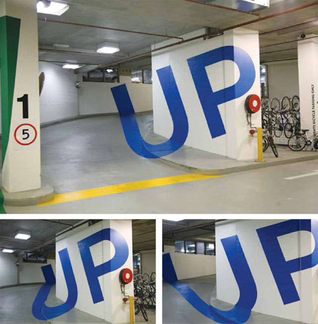
These were my final designs for wayfinding: I really loved the work of Axel Peemoeller. He uses plain, obvious designs which challenge the viewer's sense of humour. I tried to do this with my desings:


I was satisified with my images as they draw from a strong artist inspiration and match the requests of the students, from their answers. I wanted something which encompassed the creative nature of art, but which would appeal to those who did not have an artistic background. If I had to do this exercise again I would try using colour, although I realy wanted the pictures themselves to look like sketches on the wall as this would contrast to the tradition of wayfinding as bold, distinguishable images.

Wayfinding


I would really like to do something like this when creating my own wayfinding but I would worry that people might take it as a slight on their intelligence. I think that it would be really nice to incorperate a sense of art in the wayfinding, for example if we did end up having flower images on the walls to somehow have this in the wayfinding.
I also wanted to think about ways this could appeal to boys, and Banksy sprang to mind. I think that we could use his urban style in wayfinding, to make it seem less aimed at girls, and also to give a youthful feeling to the school.

Wayfinding

Wayfinding
Wayfinding is important as it is a seminal part of our project. Due to the nature of the school, it may be necessary to create methods of wayfinding that are different form the traditional methods. I really like these examples:
I think that they are so blatantly obvious that they evoke a sense of humour whilst being stylish.


More powerpoint stills